Paypal to get new website design
Link: Paypal to get new website design
Filed under: Companies News, Paypal News, Web Development News, Ecommerce News, Internet News, Webmaster News, Business News
With Paypal having recently moved to Luxembourg, and with Google Checkout chasing on their heels, Paypal are now applying a new redesign to their website.
Interestingly enough, after their last redesign in September 2004, it seems Paypal are going retro, with their new design reclaiming the silvered login box that used to help define their site previously.
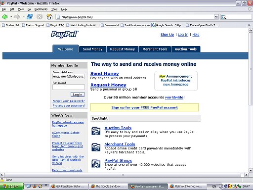
The new Paypal site design looks like this:

as opposed to their current design as this:

And interestingly enough, here’s what Paypal’s website looked like before late 2004:

And the verdict on the design?
Well, aesthetically pleasing it isn’t, with hard grey clashing with blue tones makes the site somewhat depressing - the effect is reminiscent to what you might expect if you took a rusting old Soviet frigate and tried to give it a splash of paint.
Still, the site tries to focus on the marketing hook to reassure consumers - that Paypal is safe and secure.
However, Paypal users still need to be very aware that Paypal is one of the main targets in phishing scams, and you should never respond to an email claiming to be from Paypal that doesn’t mention your name.


 Business News


